Hey everyone!
Back with an update. Busy past couple of days. It was a holiday over here in the US, plus I engaged in a bit of turbo-buffoonery with my prop. A couple of days ago a decided I didn't like the heads on top of the dagger. I do like the skulls on the bottom though, so I tried to incorporate that design up top.
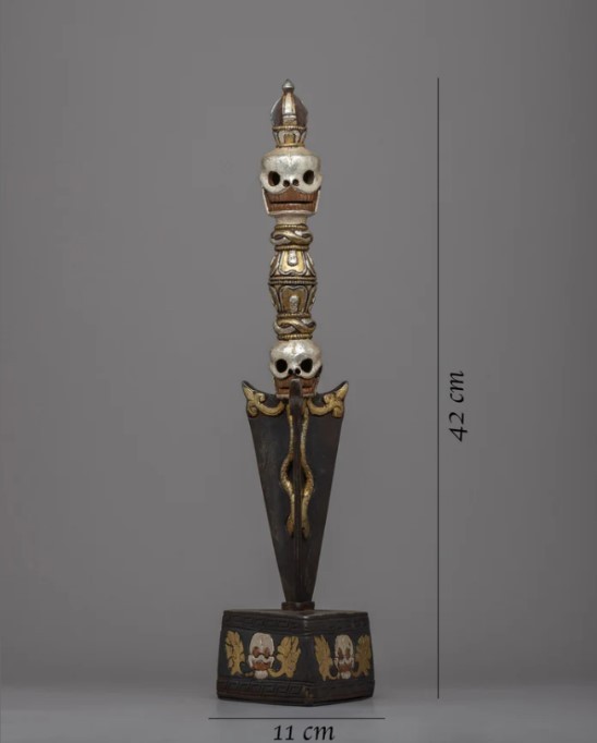
First I'll show the ref that inspired the top skull:

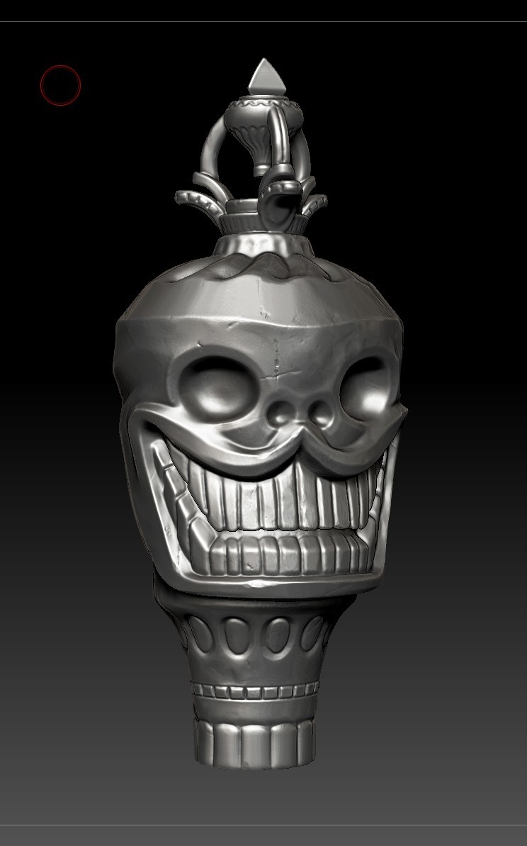
And now my skull:

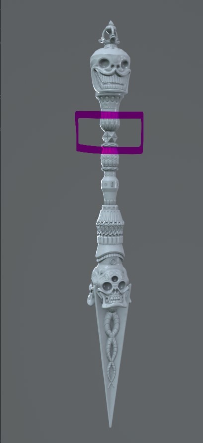
So you'd think this would be a fairly normal swap out, but this is where the buffoonery lies. While swapping the skull, I also decided to change the proportions on the rest of the dagger. For the worst. I don't know what I was smoking, but I decided this looked cool:

It did not look cool. That little cube, combined with the huge top, looked super weird. Unfortunately, I figured that out after I had done all new UVs and bakes. And UV'g this decimated geometry totally sucks. So I decided to go back and fix it. One final decimation and UV to rule them all. Here's where I landed after the bake:
With all this effort trying to save time with the decimated geo, I probably could have just made a nice low-poly. Live and learn though. Here's to hoping the extra geo looks great in the renders. I'm down to the wire here with time, but textures and renders to follow soon! I swear it will be done by the 10th!
Catch ya soon!